


Fluid spacing system ব্যবহার করে responsive design তৈরি করা এখন modern web design-এর জন্য খুবই গুরুত্বপূর্ণ।
Required Plugin:
এই system ব্যবহার করতে আপনি FluentSnippets plugin ব্যবহার করতে পারেন 👉 FluentSnippets
এই system ব্যবহার করতে আপনি FluentSnippets plugin ব্যবহার করতে পারেন 👉 FluentSnippets
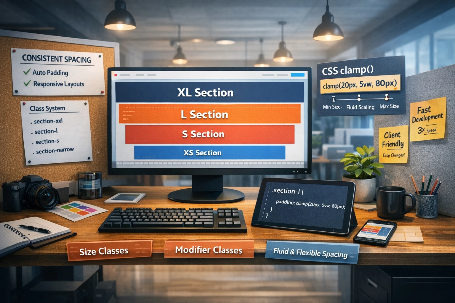
Full Class Structure (XXL → XXS)
| Class | Use Case | Padding Range |
|---|---|---|
| section-xxl | Hero Section | 150px – 160px |
| section-xl | Large Feature Area | 110px – 120px |
| section-l | Standard Section | 90px – 100px |
| section-m | Medium Content Block | 70px – 80px |
| section-s | Small Section | 50px – 60px |
| section-xs | Compact Section | 35px – 45px |
| section-xxs | Tight Layout | 20px – 30px |
Example CSS (Clamp)
.section-xl {
  padding: clamp(110px, 10vw, 120px);
}
Summary:
Fluid spacing ব্যবহার করলে আপনার design সব screen-এ balanced এবং professional থাকবে।
Fluid spacing ব্যবহার করলে আপনার design সব screen-এ balanced এবং professional থাকবে।
/* [ignoring loop detection] */
/*
   =============================================
   ELEMENTOR ATOMIC SPACING - SAFE VERSION (FIXED)
   =============================================
*/

:root {
    --fluid-side-padding-min: 1.25rem;
    --fluid-side-padding-max: 5rem;
    --section-xxl-padding-min: 9.375rem;
    --section-xxl-padding-max: 10rem;
    --section-xl-padding-min: 6.875rem;
    --section-xl-padding-max: 7.5rem;
    --section-l-padding-min: 5.625rem;
    --section-l-padding-max: 6.25rem;
    --section-m-padding-min: 5rem;
    --section-m-padding-max: 5rem;
    --section-s-padding-min: 3.75rem;
    --section-s-padding-max: 3.75rem;
    --section-xs-padding-min: 2.5rem;
    --section-xs-padding-max: 2.5rem;
    --section-xxs-padding-min: 1.5rem;
    --section-xxs-padding-max: 1.5rem;
    --section-header-padding-min: 1.25rem;
    --section-header-padding-max: 1.25rem;
    --section-hero-height: 100vh;
    --section-offset-header: 80px;
    --section-narrow: 62.5rem;
    --section-narrow-xs: 45rem;
}

/* Side Padding - শুধু নির্দিষ্ট ক্লাসগুলোতে কাজ করবে */
.section-xxl, .section-xl, .section-l, .section-m, .section-s,
.section-xs, .section-xxs, .section-header, .section-hero,
.section-narrow, .section-narrow-xs {
    padding-left: clamp(var(--fluid-side-padding-min), 6.522vw + -0.217rem, var(--fluid-side-padding-max)) !important;
    padding-right: clamp(var(--fluid-side-padding-min), 6.522vw + -0.217rem, var(--fluid-side-padding-max)) !important;
}

/* Vertical Padding (Desktop Logic) */
.section-xxl { padding-top: clamp(var(--section-xxl-padding-min), 1.087vw + 9.13rem, var(--section-xxl-padding-max)) !important; padding-bottom: clamp(var(--section-xxl-padding-min), 1.087vw + 9.13rem, var(--section-xxl-padding-max)) !important; }
.section-xl  { padding-top: clamp(var(--section-xl-padding-min), 1.087vw + 6.63rem, var(--section-xl-padding-max)) !important; padding-bottom: clamp(var(--section-xl-padding-min), 1.087vw + 6.63rem, var(--section-xl-padding-max)) !important; }
.section-l   { padding-top: clamp(var(--section-l-padding-min), 1.087vw + 5.38rem, var(--section-l-padding-max)) !important; padding-bottom: clamp(var(--section-l-padding-min), 1.087vw + 5.38rem, var(--section-l-padding-max)) !important; }
.section-m   { padding-top: var(--section-m-padding-max) !important; padding-bottom: var(--section-m-padding-max) !important; }
.section-s   { padding-top: var(--section-s-padding-max) !important; padding-bottom: var(--section-s-padding-max) !important; }
.section-xs  { padding-top: var(--section-xs-padding-max) !important; padding-bottom: var(--section-xs-padding-max) !important; }
.section-xxs { padding-top: var(--section-xxs-padding-max) !important; padding-bottom: var(--section-xxs-padding-max) !important; }
.section-header { padding-top: var(--section-header-padding-max) !important; padding-bottom: var(--section-header-padding-max) !important; }

/* Layout Fixes */
.section-hero {
    min-height: var(--section-hero-height) !important;
    display: flex !important;
    flex-direction: column !important;
    justify-content: center !important;
}

.section-narrow, .section-narrow.e-con { max-width: var(--section-narrow) !important; width: 100% !important; margin-left: auto !important; margin-right: auto !important; }
.section-narrow-xs, .section-narrow-xs.e-con { max-width: var(--section-narrow-xs) !important; width: 100% !important; margin-left: auto !important; margin-right: auto !important; }
.section-full, .section-full.e-con { max-width: 100% !important; width: 100% !important; }

.section-offset { padding-top: calc(var(--section-offset-header) + var(--section-xxl-padding-min)) !important; }

/*
   =============================================
   TABLET & PHONE OVERRIDES
   =============================================
*/

/* Tablet Layout (1024px and below) */
@media (max-width: 1024px) {
    .section-xxl, .section-xl, .section-l, .section-m, .section-s,
    .section-xs, .section-xxs, .section-header, .section-hero,
    .section-narrow, .section-narrow-xs, .section-full {
        /* Top/Bottom: 70px, Left/Right: 20px */
        padding: 4.375rem 1.25rem !important;
    }
}

/* Phone Layout (767px and below) */
@media (max-width: 767px) {
    .section-xxl, .section-xl, .section-l, .section-m, .section-s,
    .section-xs, .section-xxs, .section-header, .section-hero,
    .section-narrow, .section-narrow-xs, .section-full {
        /* Top/Bottom: 50px, Left/Right: 15px */
        padding: 3.125rem 0.9375rem !important;
    }
}